Hello,
I’m trying to replicate the results of this threat but I’m not able to progress. I sample current measurements from a current sensor and I’m trying to plot the FFT. The measurements in InfluxDB have this pattern:
SELECT "FFT_Freq_0", "FFT_Freq_1", "FFT_Magn_0", "FFT_Magn_1" FROM "meas_ext" WHERE $timeFilter LIMIT 10
which returns a table like this:
Time | FFT_Freq_0 | FFT_Freq_1 | FFT_Magn_0 | FFT_Magn_1 |
t1   |     0      |     32     |     1000   |     120    |
t2   |     0      |     32     |     2002   |     233    |
t3   |     0      |     32     |     567    |      56    |
where obviously I have the various frequencies and the respective amplitudes. I understand that getting the same measurements over time for the frequencies is a bit dummy, but I haven’t found a way yet in grafana to enter their values in a separate table from my measurements.
Anyhow, the closest I’ve reached to get a meaningful diagram is via the actual “manual” query:
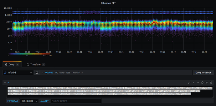
SELECT "FFT_Magn_0", "FFT_Magn_1", "FFT_Magn_2", "FFT_Magn_3", "FFT_Magn_4", "FFT_Magn_5", "FFT_Magn_6", "FFT_Magn_7", "FFT_Magn_8", "FFT_Magn_9", "FFT_Magn_10", "FFT_Magn_11", "FFT_Magn_12", "FFT_Magn_13", "FFT_Magn_14", "FFT_Magn_15", "FFT_Magn_16", "FFT_Magn_17", "FFT_Magn_18", "FFT_Magn_19", "FFT_Magn_20", "FFT_Magn_21", "FFT_Magn_22", "FFT_Magn_23", "FFT_Magn_24", "FFT_Magn_25", "FFT_Magn_26", "FFT_Magn_27", "FFT_Magn_28", "FFT_Magn_29", "FFT_Magn_30", "FFT_Magn_31" FROM "meas_ext" WHERE ("deviceID" = 'CurSensor_MCU') AND $timeFilter
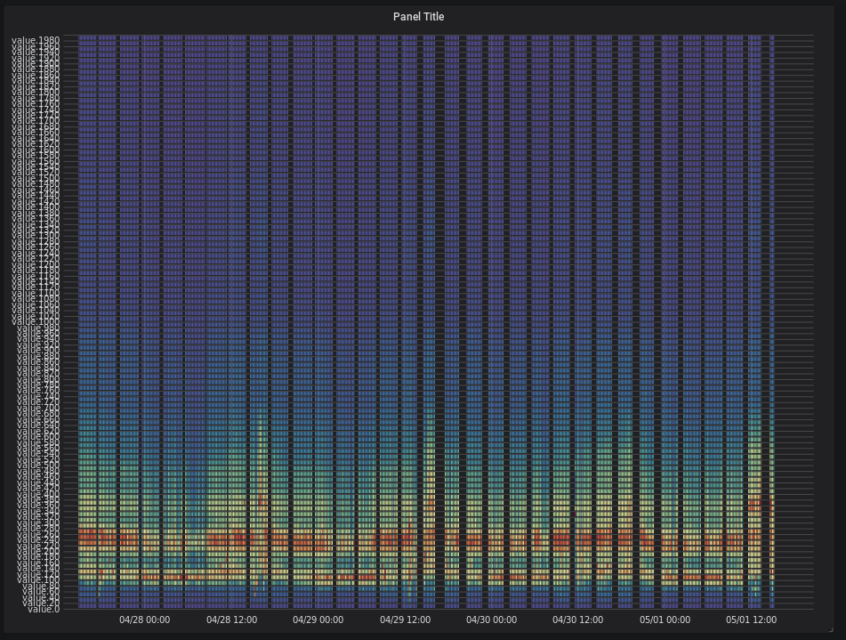
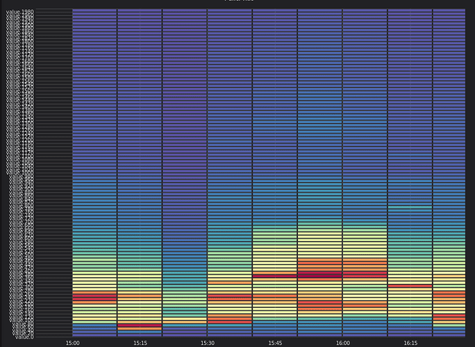
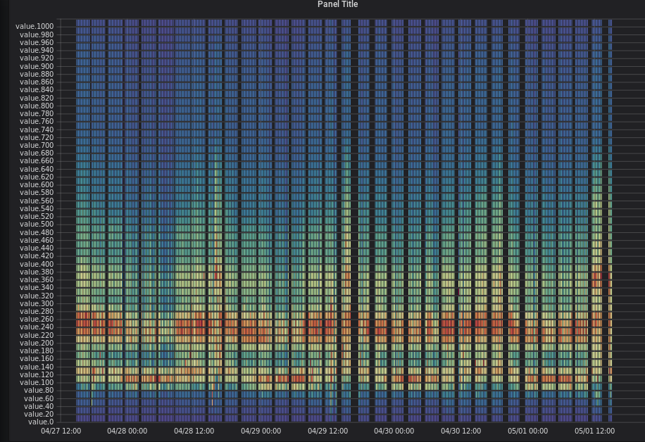
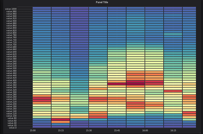
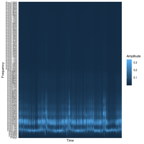
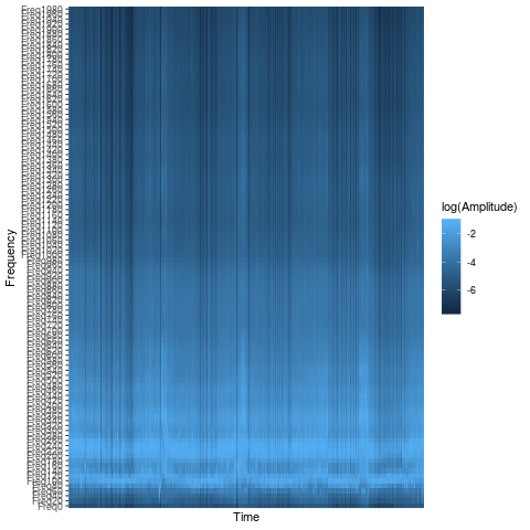
which gave me a heatmap like this
In principle it’s close to what I’m trying to achieve. I like to maintain the time axis because it shows nicely how the FFT amplitudes change in time. Then on the Y-axis I have the log10 representation of the amplitudes (actually not exactly the amplitudes, I think heatmap shows a COUNT of the amplitude values that fall within each bucket). What is missing from this picture is the frequencies. The diagram can be read in a horizontal manner, that is for example the top 2 blue lines correspond to frequencies 0 Hz and 32 Hz (I sample a DC signal mainly, with some noise in higher frequencies). The yellowish areas correspond to higher frequencies with much smaller amplitudes. However this diagram does not display any frequency information and this is what I want to achieve somehow as at the beginning of this thread.
Can someone point me to what is wrong with my queries and my database setup?
