hey @clemens this is awesome. we also just got some audio of a queenless hive, would be good to compare. also, what are you using to visualise the data like this. it looks really nice!
hey @clemens this is awesome. we also just got some audio of a queenless hive, would be good to compare. also, what are you using to visualise the data like this. it looks really nice!
… some more visualizations and statistics directly rendered by sox. Thanks again, @clemens!
$ apt install sox sox-fmt-all gnuplot xvfb
$ export original=colony-with-queen-gruber.mp3
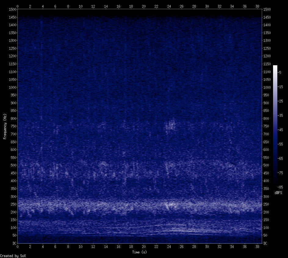
$ sox $original $original.wav remix 1,2 norm -3 sinc 30-1500 rate 3000
$ export audio=colony-with-queen-gruber.mp3.wav
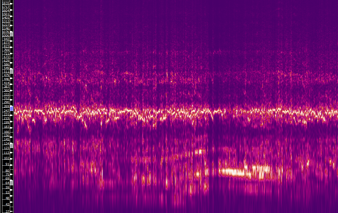
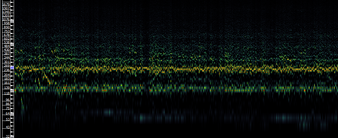
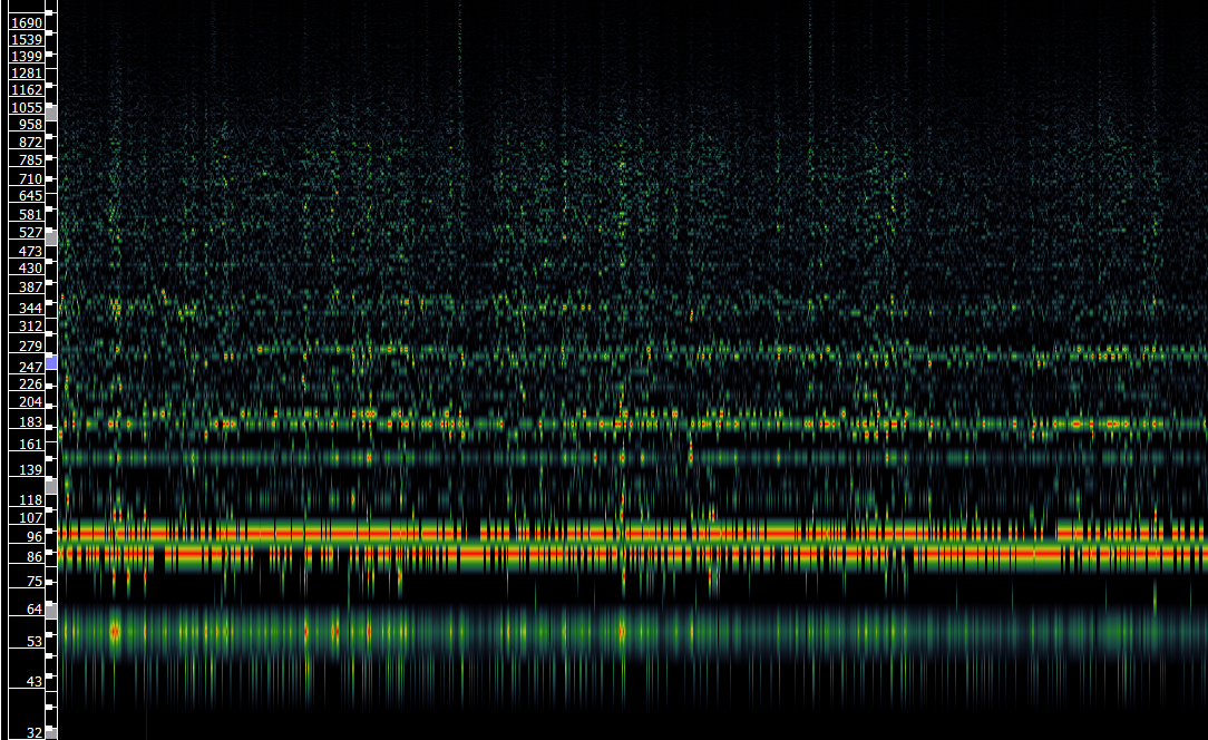
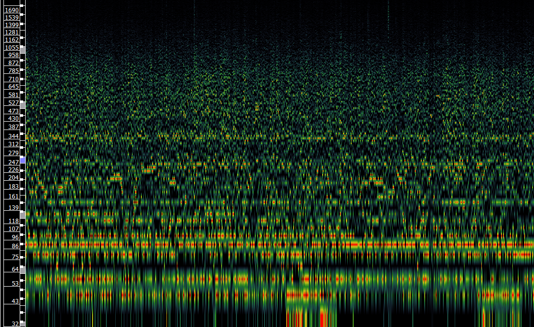
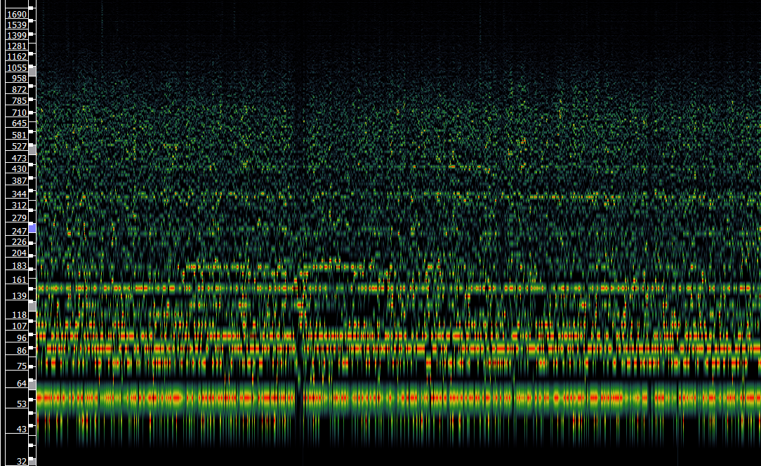
$ sox $audio -n spectrogram -h -m -p 3 -z 85 -y 768 -o $audio-spectrogram.png
$ export audio=colony-with-queen-gruber.mp3.wav
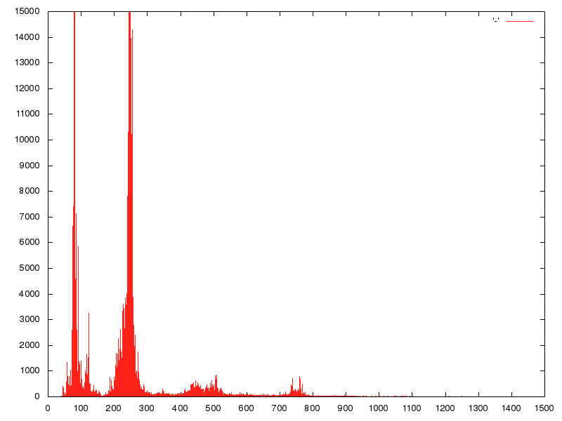
$ sox $audio -n stat -freq 2>&1 | sed -n -e :a -e '1,15!{P;N;D;};N;ba' | xvfb-run gnuplot -e "set terminal png size 800,600 enhanced font 'Helvetica,10'; set output '$audio-power.png'; set xtics 100; set ytics 1000; set yrange [1:15000]; plot '-' with impulses"
$ sox colony-with-queen-gruber.mp3.wav -n stat -rms

Samples read:           3432960
Length (seconds):     38.922449
Scaled by rms:         0.002571
Maximum amplitude:     7.352207
Minimum amplitude:    -5.996453
Midline amplitude:     0.677877
Mean    norm:          0.770147
Mean    amplitude:     0.020792
RMS     amplitude:     1.000000
Maximum delta:         4.270675
Minimum delta:         0.000000
Mean    delta:         0.172402
RMS     delta:         0.230643
Rough   frequency:         1618
Volume adjustment:       52.910
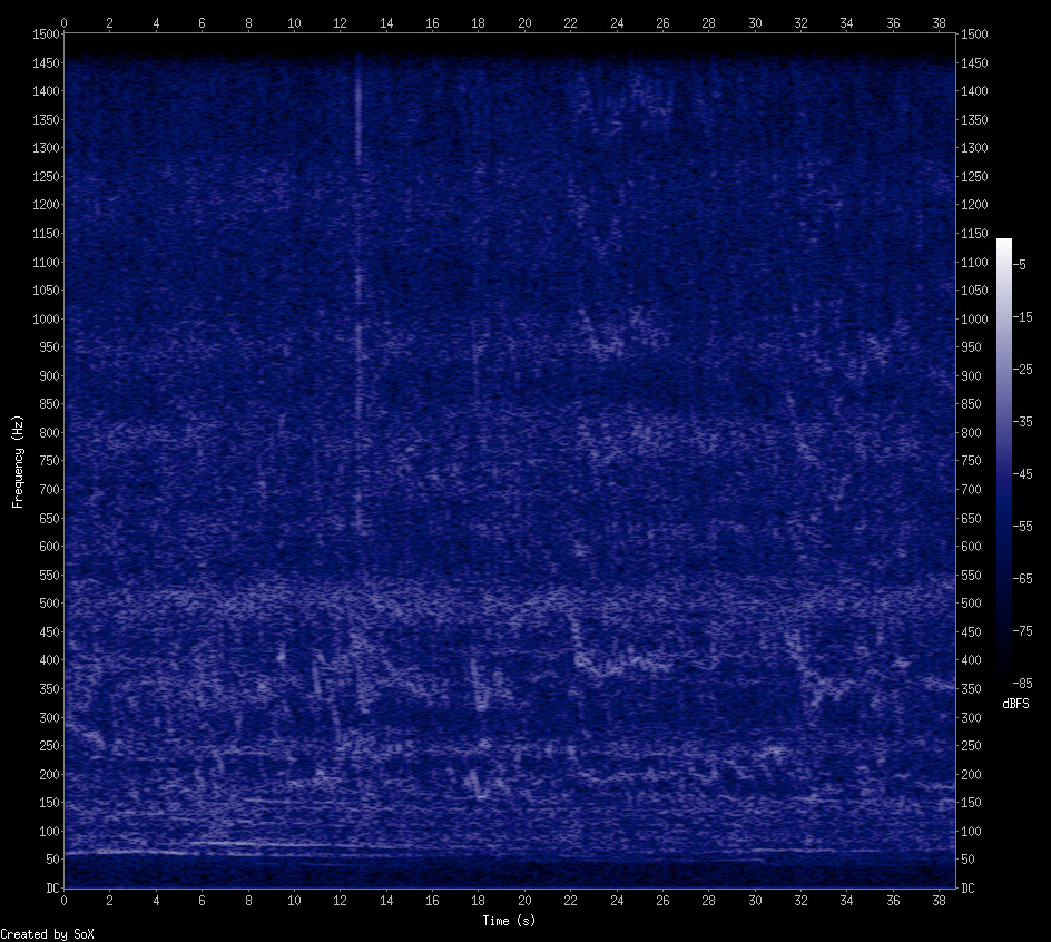
$ sox colony-without-queen-gruber.mp3.wav -n stat -rms

Samples read:           3430656
Length (seconds):     38.896327
Scaled by rms:         0.001972
Maximum amplitude:    17.313944
Minimum amplitude:   -20.420744
Midline amplitude:    -1.553400
Mean    norm:          0.780207
Mean    amplitude:     0.026920
RMS     amplitude:     1.000000
Maximum delta:        10.756859
Minimum delta:         0.000000
Mean    delta:         0.310264
RMS     delta:         0.426603
Rough   frequency:         2994
Volume adjustment:       24.831
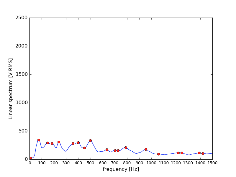
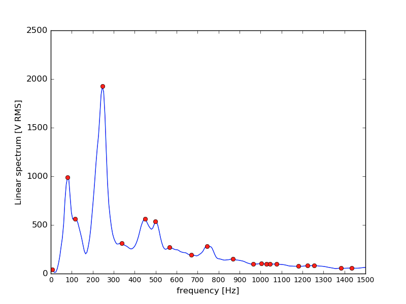
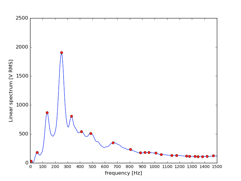
scipy.signal.welch”scipy.signal.argrelmax”matplotlib”Remark: Tooling is available via audiohealth per commit 7a8dc698. Synopsis:
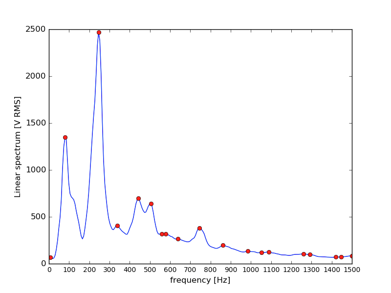
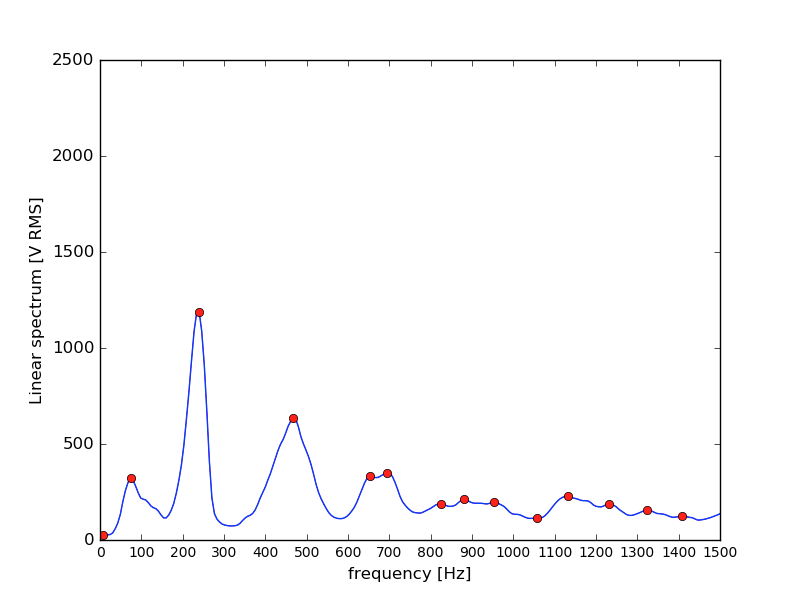
$ xvfb-run audiohealth power --audiofile samples/colony-with-queen-gruber.mp3 --pngfile samples/colony-with-queen-gruber.png
==============
Peaks by power
==============
        2468.26 RMS            246.09 Hz
        1347.00 RMS             79.98 Hz
         695.66 RMS            442.97 Hz
         638.16 RMS            504.49 Hz
         407.23 RMS            338.38 Hz
         380.44 RMS            744.43 Hz
         318.76 RMS            578.32 Hz
         316.26 RMS            559.86 Hz
         265.35 RMS            639.84 Hz
         195.68 RMS            861.33 Hz
         133.79 RMS            984.38 Hz
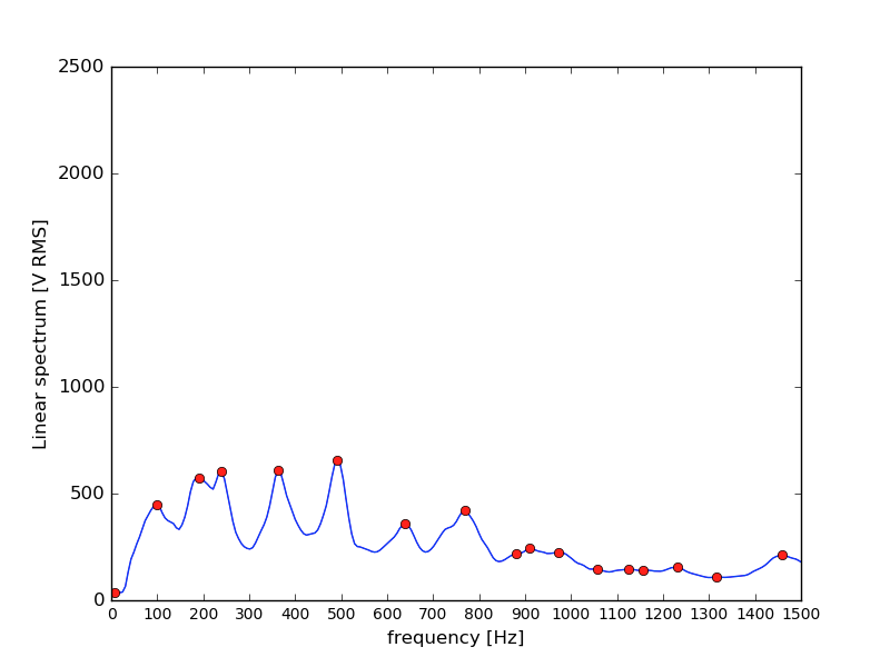
==============
Peaks by power
==============
         345.18 RMS             73.83 Hz
         332.28 RMS            498.34 Hz
         307.49 RMS            239.94 Hz
         296.29 RMS            399.90 Hz
         290.97 RMS            147.66 Hz
         281.33 RMS            184.57 Hz
         280.66 RMS            356.84 Hz
         210.75 RMS            787.50 Hz
         203.32 RMS            449.12 Hz
         179.54 RMS            953.61 Hz
         169.39 RMS            633.69 Hz
         158.33 RMS            701.37 Hz
         157.61 RMS            725.98 Hz
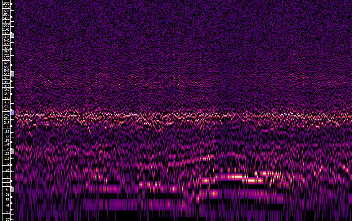
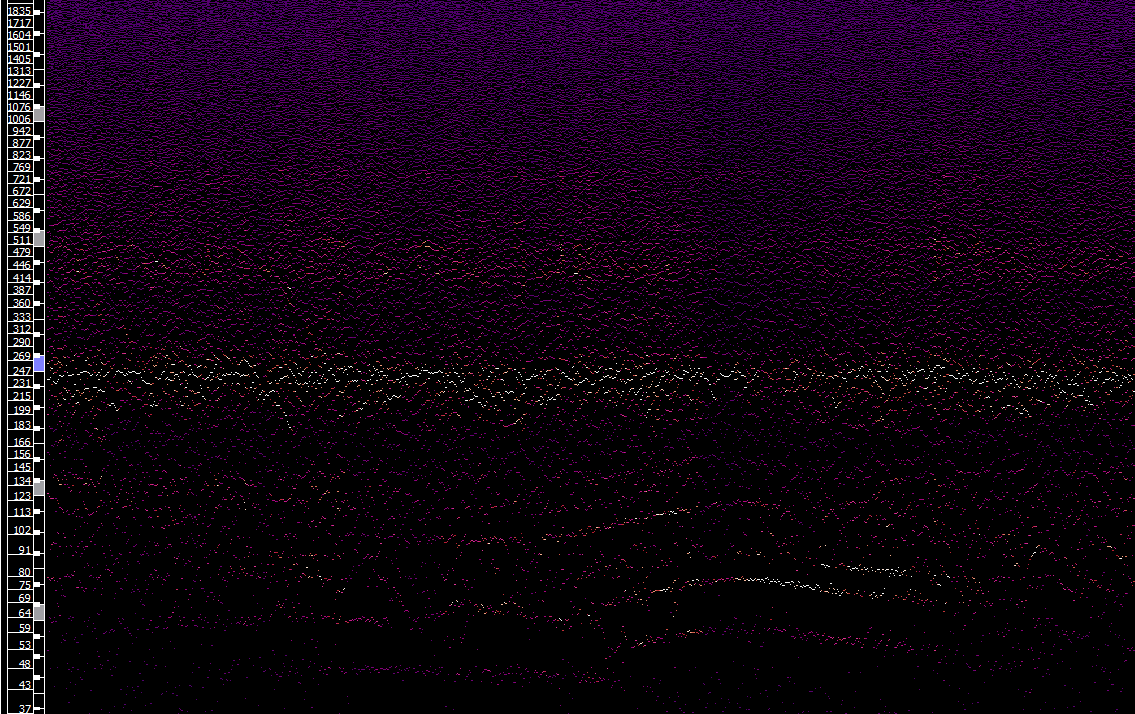
The graph was done with Sonic Visualiser http://www.sonicvisualiser.org/ . For visualization you can add different layer in the desktop program. You see here a “Peak Frequency Spectogram”.
My settings are
some examples with color cherry and different bin display options
Unfortunately the x-axis (time) is missing in the graph export. There is no legend also so it is ok for the first step but we should go on with @Andreas’ approach to make graphics via sox or an other scriptable viszalization tool. Perhaps we can have a look at the sox parameters to find an equivalent the “peak frequency spectogram”. With the default parameter the sonic spectogram looks not much different to the sox output. So tweaking some parameters should make the contrast between the energy rich frequency bins and “middle” bins better.
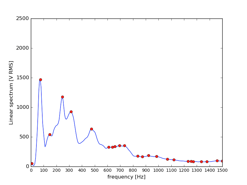
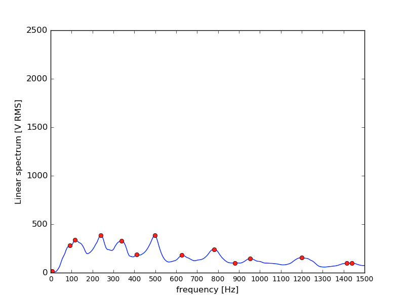
Power spectrum with peaks from data of @clemens’ seven colonies:
There is a telemetry chain from www.easyhive.org with @Ron and team as rock stars:
RasPi–flac / sox–server–website:
http://easyhive.fablab-cottbus.de/4M/Spektrum-App/index.html
Code: GitHub - jacobron/EasyHive-Datenvisualisierung
Description: Die Spektrum-App – EasyHive
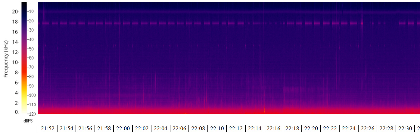
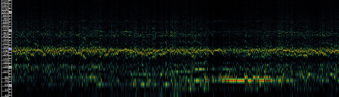
@Ron, wir hatten ja heute schon kurz am Telefon über die Soundmessung und grafische Darstellung gesprochen. Mir ist bei diversen Aufnamen bei meinen Völkern immer wieder ein recht “lautes” Freqzenzband um 250 Hz aufgefallen.
Das sehe ich so bei euch nicht (unten ein screenshot von heute) auch weil eure FFT-Darstellung die Daten auf der y-Achse linear aufträgt, bei meiner Darstellung die Y-Achse aber logarithmisch (und nicht ganz so hoch) ist:
Unten drängt sich recht viel und “oben” tut sich recht wenig. Hast du schon mal eine log-Darstellung im Kontrast zur aktuellen versucht?
Ich habe das gerade mal schnell mit ein paar zufällig ausgwählten Soundschnipseln gemacht, die genaue Quelle ist noch über den Dateinamen erschließbar:
Da sieht man schon etwas mehr. Was man leider auch sieht – und auch in den Tonaufnahmen hört – ist ein kräftiges Brummen in den Tiefen. Wenn das zu laut wird “überdeckt” es einiges.
50 Hz und ein Vielfaches davon könnten vom Netz-Strom kommen. Wie powered ihr den RasPi?
Hey Clemens,
cool dass du das gleich ausprobiert hast!
Der Pi wird über ein USB Netzteil von AUKRO mit Strom versorgt.
Eigentlich sollte das ja zu umgehen sein auch mit Netzstrom.
Die 50Hz Linie ist uns auch aufgefallen, haben leider da noch nicht weiter dran basteln könnne.
Ein Unterschied mache nauf jeden Fall auch die Mikrofone.
Wir haben solche hier:
https://www.amazon.com/gp/product/B017B88UOG/ref=oh_aui_detailpage_o02_s01?ie=UTF8&psc=1
Außerdem sahen die Spektren in den ersten Wochen nach der INstallation besser aus. Es könnte auch am Schutz der Mikrofone liegen - evtl haben die Bienen sich da durchgefressen. Wir haben eine Folie herumgewickelt.